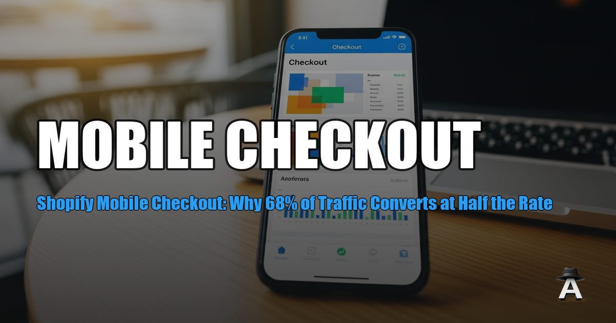
Mobile is 68% of your Shopify traffic but converts at 1.2% versus 1.9% on desktop. That gap costs the average store $12,000 per month in lost revenue. Analytics Agent's GA4 Audit breaks down your mobile versus desktop conversion data so you can see exactly where mobile shoppers drop off -- and fix the friction points that cost the most.
The problem is not that mobile users do not buy. They do -- just at a lower rate, because mobile checkout introduces friction that desktop does not. Every extra form field, every slow-loading image, every poorly placed button compounds into lost sales. The five fixes in this guide target the highest-impact friction points, backed by data on the conversion lift each one delivers.
If your Shopify conversion rate is low across both devices, start with the broader optimization guide first. This article focuses specifically on the mobile-desktop gap and how to close it.
The mobile conversion gap in numbers
The mobile conversion gap is not opinion -- it is measurable in every Shopify store's GA4 data. Here are the benchmarks from industry data (Shopify, Littledata, and Statista, 2025-2026):
- Average mobile conversion rate (Shopify): 1.2%
- Average desktop conversion rate (Shopify): 1.9%
- Mobile share of ecommerce traffic: 68% (and rising)
- Mobile share of ecommerce revenue: 52% (lower than traffic share because of the conversion gap)
Revenue impact calculator
Here is what the gap costs at different traffic levels:
| Monthly sessions | Desktop CR (1.9%) | Mobile CR (1.2%) | Revenue gap at $80 AOV | If mobile matched desktop |
|---|---|---|---|---|
| 10,000 | 3,200 desktop: 61 orders | 6,800 mobile: 82 orders | $3,760/month | 129 mobile orders (+47) |
| 30,000 | 9,600 desktop: 182 orders | 20,400 mobile: 245 orders | $11,424/month | 388 mobile orders (+143) |
| 50,000 | 16,000 desktop: 304 orders | 34,000 mobile: 408 orders | $18,880/month | 646 mobile orders (+238) |
| 100,000 | 32,000 desktop: 608 orders | 68,000 mobile: 816 orders | $37,760/month | 1,292 mobile orders (+476) |
The math: (desktop CR - mobile CR) × mobile sessions × AOV = monthly revenue gap.
For a store with 30,000 monthly sessions and an $80 average order value, closing the mobile gap completely would add $11,424 per month -- $137,088 per year. Even closing it halfway adds $68,544 annually.
This is not hypothetical. It is arithmetic applied to your GA4 data. Pull your own numbers from GA4 > Reports > Tech > Tech Details (filter by device category) and run the same calculation.
Why mobile Shopify checkout fails
Mobile checkout friction is not one big problem. It is five specific friction points that each shave a few percentage points off your conversion rate.
1. Too many form fields. Desktop users tolerate typing. Mobile users do not. Every field you ask a mobile shopper to complete on a small keyboard increases abandonment. Baymard Institute research shows the average checkout has 14.88 form fields -- nearly twice the 7-8 needed for most purchases.
2. No express checkout options. Mobile shoppers expect one-tap payment. If your checkout requires creating an account, entering a full address, and typing a credit card number, you lose the impulse buyers who would have converted with Shop Pay or Apple Pay.
3. Slow page speed. Mobile connections are often slower than desktop. A checkout page that loads in 2 seconds on desktop may take 4-5 seconds on mobile. Google's data shows 53% of mobile users abandon sites that take longer than 3 seconds to load.
4. Poor product page layout on mobile. The product page is where the buy decision happens. If images are too small to evaluate, the add-to-cart button is below the fold, or reviews require scrolling through a wall of text, mobile users leave.
5. Missing trust signals at checkout. Desktop users see your full site navigation, footer with policies, and brand elements throughout checkout. Mobile users see a stripped-down checkout with less context. Without visible trust signals (security badges, return policy, customer service info), hesitation increases.
💡 Pro Tip: Analytics Agent automatically tracks all these metrics for you. Install Analytics Agent and get instant insights without the manual work.
Fix #1 -- Reduce form fields
Each unnecessary form field removed from checkout increases mobile conversion by approximately 3% (Baymard Institute, 2025). For a store processing 400 mobile orders per month, removing two fields adds roughly 24 orders -- $1,920 per month at $80 AOV.
Fields to remove or auto-fill:
- Company name: Remove unless you sell B2B. Less than 5% of DTC orders need it
- Address line 2: Make optional and collapsed by default, not a visible empty field
- Phone number: Make optional unless required for shipping
- Separate billing address: Default to "same as shipping" with a toggle to change
Fields to auto-fill:
- City and state: Auto-populate from ZIP code. One field instead of three
- Country: Default to the customer's detected location
- Email: Enable Shop Pay or browser autofill to pre-populate
How to implement on Shopify:
- Shopify's checkout already supports address auto-completion. Verify it is enabled in Settings > Checkout > Customer Contact Method
- Under Settings > Checkout > Form Options, set optional fields to "Don't include" or "Optional"
- Enable Shopify's one-page checkout (now default for all stores)
Verification: Count your checkout fields before and after. Test on a real mobile device (not browser dev tools -- the experience differs). Measure mobile conversion rate in GA4 for the two weeks before and after the change.
Fix #2 -- Enable Shop Pay and express checkout
Shop Pay converts 1.72x better than standard checkout (Shopify, 2025). For mobile specifically, the lift is even higher because Shop Pay eliminates form-filling entirely for returning shoppers.
Express checkout options to enable:
- Shop Pay: Pre-fills shipping, billing, and payment for any shopper who has used Shop Pay on any Shopify store. 100 million users and growing
- Apple Pay: One-tap checkout for iOS users (your largest mobile segment)
- Google Pay: One-tap for Android users
- PayPal Express: Enables checkout without entering card details
How to enable:
- Go to Settings > Payments in Shopify Admin
- Under your payment provider (Shopify Payments), enable Shop Pay, Apple Pay, and Google Pay
- Under Alternative Payments, enable PayPal Express if applicable
- Under Settings > Checkout, ensure express checkout buttons appear above the standard form
Placement matters:
- Express checkout buttons should appear at the top of the checkout page, not below the form
- On the product page, add a "Buy it now" button that goes directly to checkout with Shop Pay
- On the cart page, show express options prominently above "Checkout"
Verification: Browse your store on mobile. The express checkout buttons should be visible without scrolling on both the cart and checkout pages. Track the percentage of orders completed via Shop Pay in Shopify Admin > Analytics > Reports > Sales by Payment Method. Set a target: 30%+ of mobile orders through express checkout within 60 days.
Fix #3 -- Optimize page speed for mobile
A 1-second improvement in mobile page load time increases conversion by up to 27% (Portent, 2025). Core Web Vitals directly affect both Google rankings and user experience.
Target metrics:
- Largest Contentful Paint (LCP): Under 2.5 seconds
- Interaction to Next Paint (INP): Under 200 milliseconds
- Cumulative Layout Shift (CLS): Under 0.1
Fastest wins for Shopify:
Images (biggest impact):
- Use Shopify's built-in image optimization (automatic WebP conversion)
- Set explicit
widthandheightattributes on all images to prevent layout shift - Lazy-load images below the fold. Shopify themes do this by default in Dawn and newer themes
- Limit product images to under 200KB each. Compress with Squoosh before uploading
Apps (second biggest impact):
- Each Shopify app can add JavaScript to your storefront. Audit your installed apps
- Remove apps you no longer use. Even disabled apps can load scripts
- Test speed with apps disabled: if speed improves significantly, identify the slowest app and find an alternative
Theme code:
- Use Shopify's Dawn theme or a speed-optimized theme. Custom themes with heavy JavaScript slow mobile significantly
- Defer non-critical JavaScript (chat widgets, review popups, loyalty programs)
- Minimize custom CSS. Inline critical CSS for above-the-fold content
Verification: Run PageSpeed Insights on your product page, collection page, and cart page. Focus on the mobile score. Before and after screenshots establish the baseline. Check Core Web Vitals in Google Search Console under Experience > Core Web Vitals for field data.
See Analytics Agent in Action
Discover how AI-powered insights can transform your Shopify store.
Fix #4 -- Fix the mobile product page
The product page is where mobile conversion is won or lost. On desktop, shoppers see images, descriptions, reviews, and the add-to-cart button simultaneously. On mobile, everything is stacked vertically. What appears first determines whether shoppers scroll far enough to buy.
Image optimization for mobile:
- First image should be a clear, full-product shot on white or simple background
- Enable pinch-to-zoom. Mobile shoppers need to examine details
- Limit to 4-6 images. More than that creates scroll fatigue
- Use square or portrait aspect ratios. Landscape images waste screen real estate on mobile
CTA placement:
- The "Add to Cart" button must be visible without scrolling on mobile. If your product description pushes it below the fold, move the description below the button
- Use a sticky add-to-cart bar that stays visible as the shopper scrolls
- Make the button full-width on mobile. Small buttons are hard to tap
Social proof positioning:
- Star rating and review count should appear immediately below the product title -- above the fold
- Full reviews can go below the fold, but the summary (4.7 stars, 238 reviews) must be visible immediately
- Add a "Bestseller" or "X sold this week" badge if applicable. Mobile shoppers rely on social proof more than desktop shoppers because they have less screen space to evaluate the product
Price and offer clarity:
- Price must be the second thing they see (after product name)
- If you have a sale, show the original price crossed out next to the sale price
- Free shipping threshold: display it prominently ("Free shipping over $50 -- you're $12 away")
Verification: Open your product page on three mobile devices (iPhone, Android, tablet). Screenshot above the fold on each. The product image, title, price, rating, and add-to-cart button should all be visible without scrolling. If any are missing, rearrange the page template.
Fix #5 -- Use GA4 to find YOUR specific drop-off point
Benchmarks tell you what the average store should fix. GA4 tells you what your store needs to fix. The mobile funnel report shows exactly where your mobile shoppers abandon.
How to build a mobile funnel in GA4:
- Navigate to Explore > Funnel Exploration in GA4
- Add these steps in order:
session_start(filtered to mobile)view_itemadd_to_cartbegin_checkoutpurchase
- Add a comparison: Desktop versus Mobile (use the Device Category dimension)
- Look at the drop-off rate between each step
What to look for:
- Big drop between
view_itemandadd_to_carton mobile? Your product page needs work (Fix #4) - Big drop between
add_to_cartandbegin_checkout? Cart page friction -- likely price shock, unexpected shipping costs, or no express checkout option (Fix #2) - Big drop between
begin_checkoutandpurchase? Checkout friction -- too many form fields (Fix #1), missing express checkout (Fix #2), or trust concerns - Mobile drop-off is similar to desktop at every step? The issue is traffic quality, not mobile UX. Focus on acquisition instead
Compare your numbers to benchmarks:
| Funnel step | Healthy mobile rate | Problem threshold |
|---|---|---|
view_item → add_to_cart |
8-12% | Below 5% |
add_to_cart → begin_checkout |
45-60% | Below 35% |
begin_checkout → purchase |
40-55% | Below 30% |
If your rates are below the problem threshold at any step, that step is your highest-priority fix.
How to measure mobile versus desktop in GA4
Setting up ongoing mobile measurement ensures you catch regressions and measure the impact of each fix.
GA4 reports to monitor weekly:
1. Device comparison report: Navigate to Reports > Tech > Tech Details. Set the primary dimension to "Device category." Compare conversion rate, revenue, and average order value across mobile, desktop, and tablet.
2. Mobile-specific funnel (save as exploration): The funnel exploration from Fix #5 should be saved as a recurring report. Check it weekly to spot changes in mobile drop-off rates.
3. Page speed correlation: In GA4, create a custom report correlating page load time with conversion rate by device. If mobile pages above 3 seconds show significantly lower conversion, speed optimization has the highest ROI.
Setting up mobile conversion alerts: Use real-time GA4 alerts to monitor mobile conversion rate specifically. Set a condition: "Mobile conversion rate drops below 0.8% for more than 24 hours." This catches regressions from theme updates, app installations, or checkout changes before they compound into significant revenue loss.
Analytics Agent's Mission Briefs include a mobile versus desktop performance breakdown every week -- so you see the gap trend without logging into GA4.
How this affects your AI visibility
AI shopping agents like ChatGPT Shopping evaluate stores holistically. If your mobile experience is poor -- slow loading, high bounce rates, low conversion -- those signals feed into how AI systems assess your store quality. A store that converts well on mobile signals quality and trust to both human shoppers and AI agents recommending products. Fixing mobile checkout does not just recover direct revenue; it strengthens the signals that make AI platforms more likely to recommend your products.
Action: Run a free GA4 Audit to get your mobile versus desktop conversion breakdown and identify your highest-impact fix.
💡 Pro Tip: Analytics Agent automatically tracks all these metrics for you. Install Analytics Agent and get instant insights without the manual work.
Putting it all together: the mobile optimization priority list
Not all fixes deliver equal returns. Here is the priority order based on typical impact:
| Priority | Fix | Typical conversion lift | Implementation effort | Time to measure |
|---|---|---|---|---|
| 1 | Enable Shop Pay + express checkout | 15-25% mobile CR lift | 30 minutes | 2 weeks |
| 2 | Reduce checkout form fields | 5-10% mobile CR lift | 1 hour | 2 weeks |
| 3 | Fix mobile product page layout | 5-15% mobile CR lift | 2-4 hours | 3 weeks |
| 4 | Optimize page speed | 5-27% mobile CR lift (varies) | 4-8 hours | 4 weeks |
| 5 | Use GA4 to find specific drop-off | Varies by finding | 1 hour | Ongoing |
Start with Shop Pay. It is the highest impact, lowest effort fix. Then work down the list. Measure each change independently -- do not stack five changes and try to attribute the result.
FAQ
What is a good mobile conversion rate for Shopify?
The median Shopify mobile conversion rate is 1.2% (Littledata, 2025). Top-performing stores achieve 2.5-3.5% on mobile. If your mobile conversion rate is below 1.0%, the fixes in this guide should be your top priority. Above 1.5%, focus on incremental improvements.
Does Shopify's one-page checkout help mobile conversion?
Yes. Shopify's one-page checkout (rolled out in 2023) reduced checkout steps from three pages to one, improving mobile completion rates by an estimated 4% according to Shopify's internal data. If your store is still on the older three-page checkout, upgrading is a high-priority fix.
Should I build a separate mobile site or use responsive design?
Use responsive design. Shopify themes are responsive by default, and maintaining a separate mobile site doubles your maintenance effort while creating SEO complications (duplicate content, canonical issues). Focus on optimizing your responsive theme for mobile rather than building something separate.
How long does it take to see results from mobile optimization?
Most changes show measurable impact within 2-3 weeks, assuming stable traffic volume. Enable Shop Pay and express checkout for the fastest results (often visible within one week). Speed optimizations may take 4-6 weeks to fully reflect in GA4 data due to Google's processing of Core Web Vitals field data.
How do I track mobile conversion rate separately in GA4?
Navigate to Reports > Tech > Tech Details, set the primary dimension to "Device category," and add "Ecommerce purchase" as the conversion event. This shows conversion rate broken down by mobile, desktop, and tablet. For deeper checkout analysis, use a Funnel Exploration filtered by device category.